I’ll start my “eCommerce website review” series with the brand that has stuck in my mind with its incredibly inconvenient website. I’m not alone though. There are threads on Reddit and some articles sharing this pain. I hope for release and relief when I’ll put it all “on paper” and let it go.
Let’s start. Zara has always tried and succeeded in bringing the latest fashion trends to the mass market. And sometimes the more high fashion you go, the more experimental and reckless your designs get. In my opinion though, when it comes to technology and especially eCommerce user experience, you have to respect traditional UX practices in order to keep your conversion rates optimal. I’m sure Zara is doing good, however, I’m also pretty confident they might win a lot more in terms of CRO (conversion rate optimization) if they had their eCommerce websites much more client-oriented.
So let’s start!
Home page
You can notice a blurry banner on the homepage. And there are some other concerns I have about the banner, besides its quality (which can be a bug, CDN issue, or something else):
- The banner is very contrast to the ocean of white around it.
- Why is this banner sized this way? It is neither matching the size of content container, nor the size of the viewport.
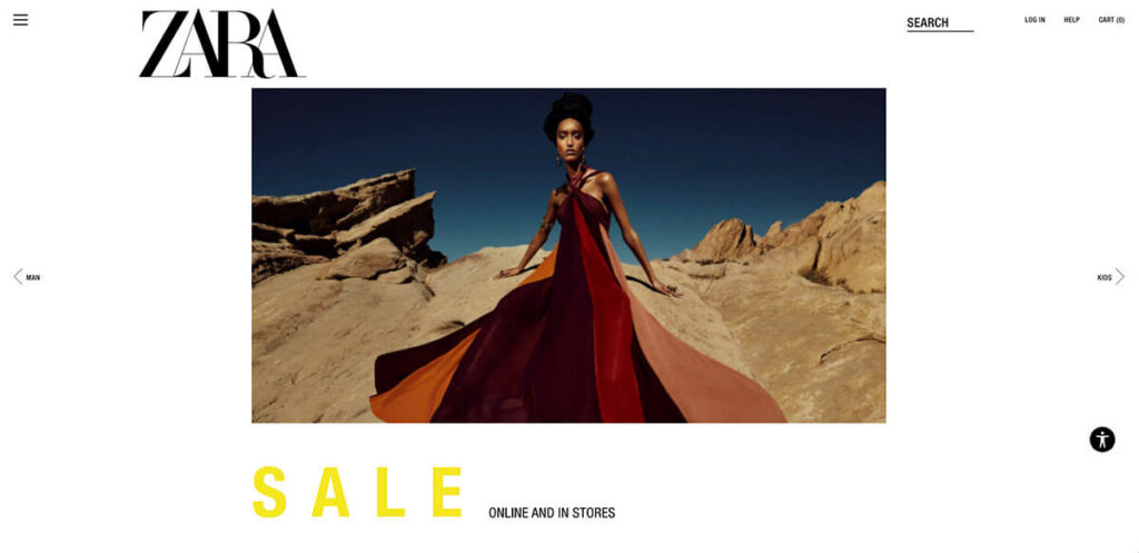
And then the SALE caption below looks like a heading and I expect to see some items from this collection below, but when I scroll down… Nothing. Just “Join our newsletter” block that’s aligned left and looks like it’s positioned out of the content container (the expectation about container width was based on the blocks above).
Fonts and Accessibility mode
And under the Newsletter subscription block, we see the links to some legal pages and links to Zara’s social media accounts. The text of the links is extremely small (9px to be precise). It’s like Zara wanted to hide this info. I can totally understand the reasons you would hide your return policy (however I’m an advocate for an explicit and client-friendly return process), but social media accounts should always be seen clearly and be easily accessible, in my opinion. Zara is actually using tiny fonts everywhere. I know their target audience is young and fresh, but even the youngest of us may have vision problems and tired eyes.
And then I notice a small Accessibility Mode icon in the bottom right. But unfortunately, this feature is messing things up even more. Let’s say I want to change the background of the page. Voila! I don’t see the banner now:
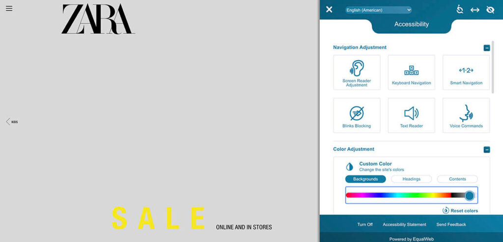
And I couldn’t find the option to increase the font. Only text magnification tool, but you have to manually use it for each element. So, I reset the Accessibility settings and move on. Or back to the top.
Zara logo is also aligned left and that gives me the understanding that the actual container starts here and it matches everything below the banner. Does a client care about the container width and positioning? No, but he sees that something is not right here. It’s like the CSS file was not loaded to apply the styles to the website, or the client has a bad internet connection. Somehow this way it feels for me.
Navigation
Zara’s home page is a free workout for your eyes, I should say. First you see the huge bold Zara logo on the top, then your focus slides down to the SALE heading, then you notice the banner (only now, yes, because it’s small and doesn’t give you any meaningful information:

It’s always great to use some nice stock graphics. But I think it should always deliver a message or serve as a CTA (call to action). Remember, you don’t have a lot of touchpoints with your eCommerce client and you cannot afford to publish meaningless content. Use all of your chances for eye-catching!
Unfortunately, the homepage of Zara’s website looks like it was designed only to fill the emptiness and meet the deadlines.
So we continue our eye exercises and start looking for a way to leave this page and finally start shopping. Mobile-first, right? So I’ll include the screenshot of the mobile version:
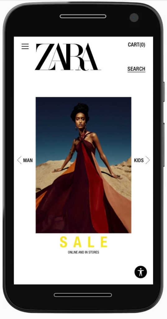
The menu icon is pushed to the top, left to the big logo, so it doesn’t capture your attention. I would suggest it should be middle-aligned vertically. But we see “Man” and “Kids” arrows on the east and west sides of our lovely banner. My first thought was it’s just to duplicate the navigation for the base categories. So I click “Kids” and realize these buttons are actually the slider navigation controls. What do I do next? I still want to scroll down for content, but I find out I have to click the banner itself to open the menu with the pre-selected “Kids” parent category. That one is good!
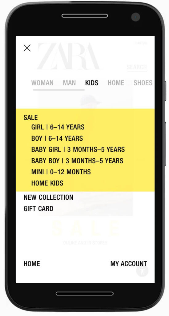
I personally do not like the black-on-yellow, but it’s a matter of taste. According to this research, black on yellow works well for people with dyslexia, however, the general recommendation by the British Dyslexia Association is black-on-creme, which I think would do even better for Zara.
The navigation for the Kids section is clear and well structured by gender and age. I select Boy | 6-14 Years because I have one at home. Then I’m offered the selection of clothing types. Let’s try t-shirts.
Product listing
The product listing is fine, however, I don’t see the need for the sliding control which changes the size of product blocks and allows you to see more items on the screen. 1 or 2 items in a row for mobile devices would perfectly do. Additionally, it has margins on top and bottom, so it takes much vertical space, that can be better used for promotion blocks, for instance. Generally, I would make the header more compact.
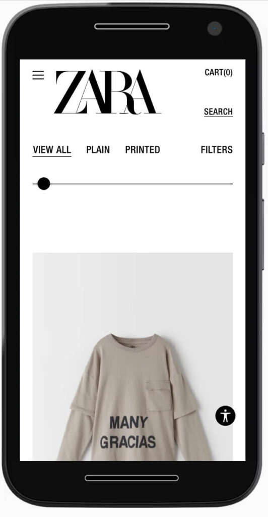
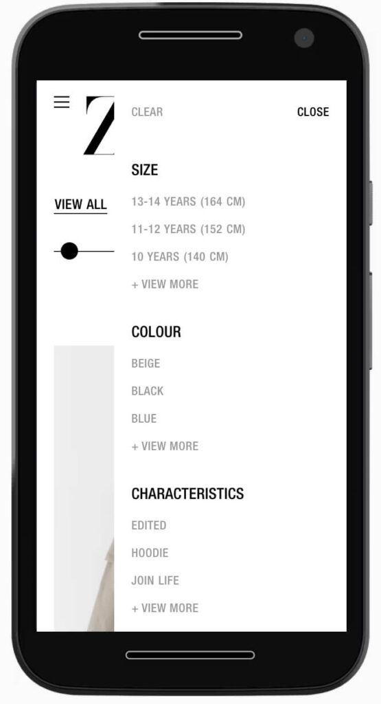
Filters are implemented very well. I always recommend using the right-side navigation (sliding sidebar) for filtering options on mobile devices. It’s very intuitive. Good job here.
Zara has used a very counter-intuitive navigation approach when you open a product and try to see additional images. Most of the websites use horizontal scrolling or a small gallery close to the main image. But when you do what you are used to, you see the next product in the category. To see additional images you have to scroll vertically. Seems easy, yes, but it’s another irritating thing that was reported to me by some of my friends buying at Zara. And this matters, since I don’t believe all other merchants would follow this practice.
Another annoying thing is that you have to swipe up to see the description of the product. Maybe it’s me, but I tried scrolling down, tapping the title. And I even thought that Zara products do not have descriptions at all, but then I managed to open it. Accidentially.
Overall, the product presentation is not engaging. You have to be a big fan of Zara to go through all of the challenges and learn more about the product, like it and eventually buy it. Every unnecessary second or click on your website increase the bounce rate dramatically, the same way slow page loading does. You have to fight for it and stop messing around here.
The desktop version of the product category listing either lacks structuring or Zara is using some innovative approach again.
The whole product grid looks like a Tetris-game. You can see big blocks, small blocks, full width grid, content container width grid, some gaps. And again: tiny font everywhere. When you open the product page, you see some bits of information and and a small black Add to cart button.
Purchase
Let’s buy this T-Shirt! I click “Add to cart” button and I am pleasantly surprised. Instead of showing a small red error saying “Please select product option” you might have seen on other websites, Zara asks me to select the t-shirt size in a much more user-friendly way:
In the cart section I haven’t found any option to estimate the shipping costs or add the promo code. Zara might not have promo codes, but it’s another omission, in my opinion. And you don’t see any explicit information about the shipping on the pages. Zara is not using one-page checkout, so you only see the shipping options and costs after spending time filling the checkout form. Good for Zara, if they use your info for retargeting or abandoned cart recovery, but bad in terms of customer experience. When I proceed to checkout, I had a bug on my Iphone 12, however I could not reproduce it in emulator:
Alright, I continue as a guest and I start filling my delivery info. The website requests my location, when I start entering Address, but it has no use, since I cannot change the region anyway (My location is Latvia, but it still shows the UK). The postcode field is case-sensitive and gives me an error when I try to enter my postcode as LU1 5ex so I have to switch to caps and spend my time re-entering it. Seriously, capitalization can be done on Zara’s side and improve my buying journey. After giving Zara my delivery info, I finally see the shipping options.
UX concerns:
- The left padding is bigger than right one
- You always want to zoom out to reposition the checkout
- The sticky “Continue” button should always be visible, not only when you scroll down. Current setup produces an strange behavior of the button. It appears and disappears.
Returns
As mentioned before, there’s no explicit return policy declaration and you can only find it by going to Menu -> Info -> Help -> Returns and Exchanges. And you find out that the return link can be found in the transactional emails they send to you. Now open your inbox and go through another challenge Zara has prepared for you.
Final words
While Zara has some really good solutions here and there (product filters, “Match with” recommendations, size/option select on “Add-to-cart”), this is still the most impractical eCommerce website I have ever seen. I mean big brands, of course.
I’m pretty sure Zara has paid a lot for this website. And I’m sure Zara is still doing well not because of, but despite their website. Conversion rate optimization is critical for eCommerce business and it translates to revenue directly, and you can clearly see, there are a lot of ways to improve it for Zara.
Get in touch today and we’ll review your shop: